How many times have you taught the color wheel in your life? Probably too many to count.

But how many times has it been a meaningful experience for your kids? How many times has it even been a worthwhile experience for your kids? You may be thinking right now about “building foundational skills” or basic knowledge all kids need to have. And you’re right. But as our knowledge of color expands, the ways in which we can–and should–teach color are expanding as well.
It’s okay to quit teaching the color wheel.
The biggest idea in color theory right now is about how we should visualize color in three dimensions. Teaching students about color in three dimensions leads to a deeper understanding of how color works and that knowledge can be used to create. Rather than just dealing with hues, students can be learning about hues, values, and chromas.
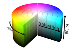
- Hue is simply the name of the color.
- Value is the lightness or darkness of the color.
Black is a dark value or low value. White is a light value or high value. - Chroma is the intensity or saturation of a color.
A gray, or other neutral, would be an extremely low chroma. Fire-engine red would be a high-chroma red.
The basic method of teaching the color wheel works. It is fairly limited, however, because it is based on thinking about color in traditional, two-dimensional ways. If you want to teach about hue, value, and chroma, you need something more. When you decide to ditch the color wheel, you need to bring in more and better options.
So how do we expand our teaching of color? Below are 4 easy-to-implement ideas.
1. Don’t Forget Value!
When you go beyond the basic color wheel, you need to bring in value as well! We always teach value–it is one of the fundamentals of any art class. I would guess one of the first things that happens when you break out the paint is that you have your students create a value scale with a color of their choice. Or maybe even create a small monochromatic painting. These are great ways to teach value, but the following idea from AOE writer Abby Schukei might be even better.

Have your students find and arrange objects of different colors from the lightest value to the darkest value. Then have them snap a photo using a tablet, phone, or another digital camera. After they take the photo, have them check to see how they did by making the photo black and white.
This exercise will allow students to understand how different hues can relate to each other through value–not just understand how a single hue gets lighter and darker.
2. Try a Color Sphere
Once you have a handle on hue and value, it’s easy to bring in ideas about chroma (intensity).
In a basic value scale, you take a hue and change its value to make it lighter or darker. You can address chroma in a similar way using a color sphere. In this case, the hues get lighter at the top of the sphere, darker at the bottom of the sphere, and less saturated toward the center of the sphere.
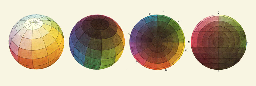
A color sphere can also help students who seem to fall into the trap of using paints straight out of the tube. Showing them how to mix with black and white enhances their understanding of value.
Allowing them to experiment with chroma will help them develop their understanding even further. Realizing the nuances they can achieve will help students see the benefits of taking the time to mix their own custom colors.
3. Learn More About Color Interaction
While it’s, of course, worthwhile to learn about color schemes, you can push your students’ color knowledge so much further.
Understanding how and why colors interact is vital, and it helps to know which color combinations are pleasing to the eye.

But what happens when a pure hue contrasts with muted analogous hues? The rules on color schemes aren’t as hard and fast as we think. Allowing students to see the various ways in which colors interact will help them have a better understanding of color theory and how they can use those ideas in their own work.
4. Pay Attention to Color Nuances
So often, we teach about color symbolism: red corresponding with anger, green with envy, yellow with happiness. But it’s more nuanced than that! Colors can have different meanings depending on whether they are light, dark, pure, or muted. Show examples of how those nuances can be used to challenge viewers’ preconceptions about color, and allow students to experiment with these same ideas in their own work. You might just be surprised by what your students can do.
It’s time for us to stop limiting our students, and limiting our teaching, by continuing to teach the color wheel. It’s time to go beyond. Learning about color in three-dimensions takes the student experience to a whole new level. Understanding color and color relationships is fascinating to them. More importantly, developing those understandings leads to more visually appealing and nuanced artwork.
If you’re looking to dive even deeper into color theory, check out these five other great resources.
- Color Theory Basics PRO Learning Pack
- 5 New Ideas for Teaching Advanced Color Theory
- All Our Favorite Ways to Teach Color Theory in One Place!
- A Better Approach to Color Theory – Part 1 (Ep. 112)
- A Better Approach to Color Theory, Part 2 (Ep. 113)
Do you teach your students about color in three-dimensions?
What are your favorite activities for teaching color theory?
Magazine articles and podcasts are opinions of professional education contributors and do not necessarily represent the position of the Art of Education University (AOEU) or its academic offerings. Contributors use terms in the way they are most often talked about in the scope of their educational experiences.