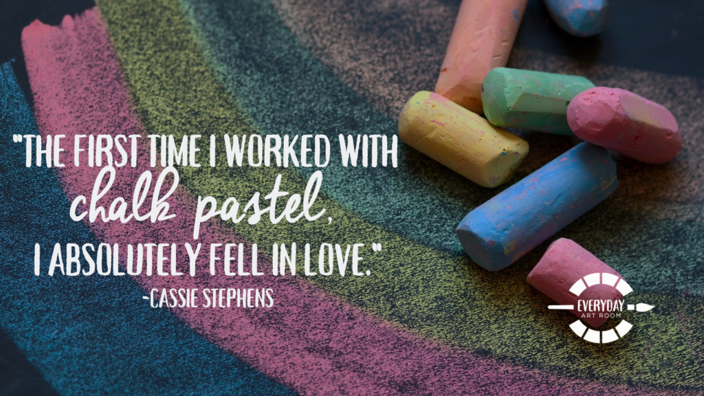
Cassie absolutely loves chalk pastels, and today’s episode is a deep dive into everything you need to know about how to teach them. Join her as she discusses how to ‘address the mess’ of rainbow chalk dust that always arises (9:15), tips for finishing chalk projects (11:45), and some of her (and her students’) favorite chalk pastel lessons (16:45). Full episode transcript below.
Resources and Links:
- Chalk Pastel Lesson #1 from Cassie’s blog
- Chalk Pastel Lesson #2 from Cassie’s blog:
- A simple chalk pastel gradient
- Check out these awesome marbleized prints using chalk!
Transcript
Do you all remember that one art project that you worked on growing up where when you were working on it, or maybe when you were finished, you were just like, yeah, this is what I want to be doing for the rest of my life? For me, I remember it like it was yesterday. It was a chalk pastel project that we working on of an abstract cityscape and I was in love. I loved my work and I really loved chalk pastel. It was the first time that I’d had the chance to work with it. The colors were so vibrant and they blended so beautifully.
As you can imagine, my disappointment when I became an art teacher and discovered the chalk pastel that were in my art room. Y’all, it was like sidewalk chalk and the moment I put the chalk to paper, nails on a chalkboard quality. In fact, it’s making my hands sweat just to think about it. And if you’re like that too, if you are an art teacher who’s not a fan of chalk pastel, well, let me tell you, today I’m about to change your mind. I have discovered the best chalk pastel for my students to work with as well as some of my most favorite projects. So I’m going to share that with you today. This is Everyday Art Room and I’m Cassie Stephens.
Now, like I said most chalk, at least the student grade, student quality chalk that you might have in your art room. Perhaps left over from the art teacher, like what was in my stash, is mostly made of filler and you can tell right away a good brand of chalk versus a yuck-o brand. And it’s all in the weight. If you’ve ever picked up a piece of chalk and not only is it very light, super pastelly in color, but feels very lightweight, then you know that what you’re using, or your students are using, is mostly made of filler. What you instead want is a brand of chalk that’s a little bit heavier because what that means is it’s mostly filled with pigment. Pigment, as you know, is another word for color baby, color. It has nothing to do with pigs and I only say that because that’s just something I say to my students every single time I say the word pigment. So I know you are not ignorant. I know you know what pigment is, but what can I say, habits, they’re hard to break.
So, look at your oil … Excuse me, your chalk pastel stash, and if you have a lot of chalk pastel that is very light in weight and color, you might want to consider donating that to a classroom teacher. They’ll love you forever. They can use it outside on the sidewalks, but you definitely need to kick it to the curb and get it out of your art room. I promised you I would tell you my very favorite brand and I’ve tried quite a bit. So grab a pencil. Write this down. I swear by these chalk pastels. It’s Faber-Castell minis. I buy the 24 pack. They call them soft pastels. Now, full disclosure, sometimes I work with Faber-Castell. Sometimes they send me art supplies and sometimes I write lesson plans for them. However, this is not just a promo. This is me speaking to you, art teacher to art teacher, these are my jam.
Now, if you back a ways on my blog you might find me talking a lot about a brand called Koss, K-O-S-S brand chalk. I used to love that brand of chalk as well. Extremely expensive and very, very difficult to find. They are not supplied in art supplied catalogs. I used to have to buy them from Amazon, but I had to stop when Amazon would accidentally ship me hair chalk instead. Yeah, hair chalk.
Anyway, friends, I’m telling you, Faber-Castell minis 24 pack soft pastels is where it’s at. You can find those in almost all of your art supply catalogs. They aren’t cheap, but let’s face it, it’s because they are not cheap in quality. So you’re going to bite a little bit for the cost, but I’m telling you it’s totally worth it and when a chalk pastel is more heavy in the pigment, then your students won’t have to use as much. So they’ll last a little bit longer. All right, so that’s the brand I strongly recommend.
Now, let’s get down to the nitty-gritty. How does using chalk look like in your art room? Well, for me I’m going to lay it out for you. I can not stand it when chalk is all together mixed up all the colors in one container because, as you know, what happens is, is all the pieces of chalk get a little bit dirty and then it’s difficult for the kids to know what color is what. And let’s be honest, nobody wants to work with dirty, yucky looking art supplies, your students included. Now you can clean chalk by just putting it in a Ziploc bag with rice and shaking it up. And what the rice does is it kind of knocks off the dirty, yucky grime on the outside of your chalk. Or you can simply not put all of your chalk pastels in one container.
Here’s how I do it, and I’m going to share with you how I’ve seen other art teachers successfully distribute their chalk pastels. For me, I was donated a bunch of these blue dual sided containers from a hospital supply company and I am only trying to give you that visual just because you might have these in your room or you might even be able to talk to your school nurse and say, “Hey, where can I find some of these containers?” There’s nothing special about them except its one container with two compartments and for me, on one side I put all of the warm colors of chalk, and then on the other side, I have all of the cold colors of chalk. This is a great visual for my students because usually, I’m telling them that they can either use all warm or all cold because of course, as you know, those are analogous-ish colors and they look better when worked together.
So that’s how I distribute my chalk. For every two students, they have one tray where one side is warm colors and the other side is cold colors. I also always provide them with a laminated color wheel and I’ll get to that in a second. That’s another learning tool for them and a way for them to know how to use what colors of chalk where.
All right, so let’s chat about how I’ve seen other art teachers distribute their chalk, which is a fabulous way to do it as well. Those chip and dip containers that you can get at the Dollar Tree. They are large, plastic, and round. They have a big center and then several sections going around the rim of the center. Got the visual in mind? Then you know what I’m talking about. And I’ve seen art teachers divide the chalk up by color in those trays as well and then that large of a tray could probably sit in the middle of a table of four students. Fabulous idea and your chalk isn’t mixed up.
Now a good buddy of mine who teaches middle school, I was recently in her room and she distributes her chalk and oil pastels in this way and I’ve started doing it with my oil pastels. That since I have a system that works for my chalk, I’m not going to venture down that road for my chalk. So let me tell you what she does. She has bought a bunch of those bead sorter containers and I’ve seen them at the craft stores. They’re usually about $2 and they are lidded. When you open the plastic lidded container, there’s probably a dozen smaller sectioned areas of the container and what she does is she keeps her chalk pastels organized by color in each one of those sections. And like I said, she does that with oil pastels as well, which I’ve started doing and I currently love. And this is great, again, if you’re going to be using this with older students, I guess, who you know are going to put your chalk hopefully, fingers crossed, back in the correct portion of the container.
So those are just a couple of ways to distribute your chalk pastels to your students where they’re not going to be all mixed up. Of course, ideally you could keep them in the lovely cardboard tray that the chalk pastels are shipped to you in, but if your students are anything like mine, they don’t always put things back so neatly in those little containers. I need a system that’s a little bit easier, like basically just putting your chalk pastel back in either the warm or the cold color side.
Now that we’ve kind of talked about my favorite brand and how I distribute my chalk pastels, let’s address the mess, shall we? Because let’s face it, it’s like rainbow dust-up in the art room when we’re working with chalk. And if the kids aren’t working with chalk correctly their artwork can soon dissolve in just a blended mess of blah. So what I tell my students to do is this, I ask my students, and this is usually when we’re working with chalk, I’m working with my students from second grade on up, I will tell them to go to the sink and get two paper towels. One paper towel that is damp, meaning they’ve got to squeeze the living daylights out of that paper towel so that it’s not dripping, and one that is dry. And the reason I have them get two paper towels is so that in between using different colors on their finger for blending of chalk pastel, they can simply wipe the other color off their finger before using another one. Wipe it off with a wet paper towel and then dry.
I used to just give my students baby wipes, but those are only damp and then when the kids take a wet finger to the chalk pastel, well it doesn’t blend anymore. And also in the past, I used to have my students get a tissue and put a tissue over their finger and blend that way, which is great for kids who don’t like the idea of touching the surface of their paper to blend. Really, you got to do what’s best for you and your students. If you don’t have a sink, you might want to go the tissue route. So like I said, that’s just what I do. That’s what works for me. However, I do really emphasize to the kids that when they have that damp and dry paper towel to keep it far away from their artwork. Meaning, don’t put your wet paper towel on top of your masterpiece or else it’ll get damaged.
So that’s one way to kind of control the mess. Oh, and let’s talk about dust. When my students have the urge to blow the excess chalk dust off their paper, I always tell them to pick up their paper, turn away from their friends, and then gently blow. And they are supposed to do that only after trying to blend down those little particles of chalk. After all, otherwise it’s just a waste of chalk pastel.
So now, how do you set a chalk picture? That’s like the biggest conundrum. So I’m going to share with you three of my favorite, favorite chalk projects. One of them you don’t even have to set. That project is going to blow your mind. But I do have a couple of favorite chalk projects where of course, you have to set them when you’re finished. When you are getting ready to set a chalk pastel picture, you need to spray it. So instead of buying that really expensive can of fixative, get yourself again to the Dollar Tree, or any dollar store, and buy hairspray. Not the squirt kind, but the aerosol can kind.
Now, I have found that hairspray has changed a little bit, whereas before it used to really provide a great mist over the artwork, it does change the color a little bit. Makes it a little bit darker, but it used to just have such a fine mist that all would do would seel it. Lately, I have noticed that instead of a fine mist, it’s a little bit speckly and does leave the artwork a tiny bit speckly. For me, it’s subtle enough that it does not harm the artwork at all and it makes it so that the chalk pastel work doesn’t get smeared as easily. And I usually do that after the kids have left, with my door propped open and it smells like the 1980s up in my room when I’ve got that Aqua Net can a flying and a floating, but at least the artwork is then set.
Okay friends, now let’s talk about my top three chalk pastel projects. Projects that are going to make you a big fan of chalk pastels, if you are not already. And by the way, I have all of these projects on both my blog and my YouTube channel. Feel free to use them in your art teaching world. To find those instructional videos, you would just have to look under the playlist called, I think, Art Lesson Videos, which kind of makes perfect sense. You would think I would remember that though.
All right, so back to my top three. This is the one that is going to blow your mind. I just learned this trick over the summer from my good buddy Jen and it is amazing. It’s like a game changer for chalk. So let me stop rambling on and on and get to it. If you have never used liquid starch with your chalk pastels, then I encourage you to get yourself to your local big grocery store because I’ve noticed smaller grocery stores don’t carry liquid starch or a big box store of any sort. Go down the laundry aisle and get the Sta-Flo, I’m pretty sure those are the only people still making liquid starch. It’ll come in a big, blue bottle. Spray liquid starch will not do the same trick. You’ve got to get liquid starch.
Have your students take a sheet of paper and with my students we were learning about the artist, Claire West, and she makes these beautiful landscapes. So for my fourth-grade students, I had them simply take a large sheet of paper, 12 by 18, fold it in half either vertically or horizontally, for their landscape. Then they had to decide, we’re starting on the sky first if they wanted a warm color sky or a cold color sky. And the reason I make them pick one or the other is because as you know when students blend all the colors together they get that lovely doo-doo brown color that we all do not like. So that’s why I tend to have them do either all warm colors or all cold, especially for this project.
So once they’ve picked out what kind of sky colors they want, they just kind of create little patches of color with the chalk and you know because it’s chalk you don’t have to fill it in completely. It can be a little bit of a light coloring of patches. It’s not like working with crayons. Once they’ve got all of their patches of color in the sky, all they have to do is dip that finger in the liquid starch and gently massage it over those patches of color. I can not describe to you enough how amazing this trick is. What the starch does is it kind of turns the chalk pastel into almost an oil painting kind of look. It’ll look very impressionistic, but the starch also will hold the particles in place. So what that means is there is no hair spraying at all needed. It doesn’t leave behind any weird residue. The kids are going to be left with clean fingers because the starch is actually clean and it’ll make it so they’ll have this beautiful sky. We did the same kind of thing to the ground.
Then once dry, they can simply take tempera paint or tempera cakes and paint over it. My students painted trees and plants and houses and fish when they made water. I mean, the possibilities are endless, but if you’ve never tried this, I know I’m going on and on, you’ve got to get yourself some liquid starch with your chalk. You’ll be amazed. So that’s project tip number one.
My second very, very favorite chalk pastel project, which is also on my blog and YouTube channel, is the Sandra Silberzweig self-portraits that my students do. This one we do on black paper and chalk I feel like just looks so beautiful on black paper. It just really pops. For this project, I also mix-up black glue that my students used to draw an abstract face. When the black glue outlines were dry inside of each section they created with their black glue, they used analogous colors.
But let’s back-up a little bit and talk about black glue. You can’t buy it. Why has Elmer’s not made a black glue yet? Do they not know we art teachers are just busting it making this black glue? I’ve made black glue a couple of different ways. One way I’ve made it this year was with India ink. I just poured a huge amount, and this is important, Elmer’s Glue-All. Don’t use the Elmer’s Washable Glue. I poured a huge amount of Elmer’s Glue-All into a plastic container and then I added, little by little, India ink into the container and stirred it up until it was a nice, rich black color. The only problem was is there was a little bit of, I guess, a chemical reaction, I mean I’m not a scientist because the glue got very gummy and sticky. I was able to pour it back into the glue bottles and the kids were able to use it. So it wasn’t really an issue. I was a little concerned though when I was stirring it up.
So if you encounter that just know that you can still put it in the glue bottles and you can still use it. Previously, I have used black tempera paint in glue. That worked well. However, I noticed that the lines spread out a little bit more. You want to make sure that you definitely use a good quality tempera paint. Don’t use any junky stuff because you know it’s going to be mostly water and it will definitely spread out.
So what I had my students do was, they followed along with a video that I created. We drew an abstract face with a pencil on black paper. Took those drawings back to our seats. Went over those pencil lines with the black glue and then set it aside to dry. The following art class, we learned all about analogous colors. So instead of just picking all warm or all cold, my students were each given a laminated color wheel. They could pick any color they wanted to from their tray, place it on the color wheel, and then they had to pick a color that was two more colors in addition, that were beside that color they picked on the color wheel. Therefore, they were picking analogous colors and this also allowed them to use colors that were both warm and cold in each section of their artwork. Y’all, I can not express to you enough how beautiful each and every one of these portraits turned out. This is always the show stopper when we have our art show. So another awesome chalk project that I just can not share my enthusiasm enough.
And my last one is actually one that we have done every year. I think this is going into our fifth year for this project. This is our Ceiling Tile Legacy Project and again, this is on my blog and you can find videos as well. So a couple of years ago, well four or five years ago, I had a street artist come to our school to do a sidewalk chalk project with my students. A street artist, by the way, is a sidewalk chalk artist and the idea was she was going to do her masterpiece on the sidewalk outside while the kids worked alongside her. The only problem was we, on that particular day, had rainstorms and possible tornadoes. So not exactly sidewalk chalk weather.
So I had to think really fast and I remembered my principal had said to me that she really wanted me to do some artwork on the ceiling tiles and yes, I know what you’re thinking, my principal is amazing. So knowing that ceiling tiles probably have a similar texture to a sidewalk, that was what we had to come up with on the fly for about a 100 second graders. My custodian was able to wrangle up 100 plus ceiling tiles. We laid them all out in the gym and this is going to seem a little bit odd to you, but we actually didn’t use the front of the ceiling tile because they’re very porous and the chalk it didn’t work very well when I was doing a little bit of a practice test run. However, the other side of a ceiling tile has almost the exact same texture as a sidewalk and that’s what my students used and that’s the project we’ve been doing every single year, for like I said, the last four years.
My students draw on that huge ceiling tile with chalk pastels. Then once they leave, we completely douse it with hairspray, but since it sits in the ceiling and nobody can touch it, it really doesn’t get damaged at all. Unless, of course, we have a leak in the roof. But once they’re up, they’re beautiful, they’re bright, and they’re a fabulous legacy and you can now see them throughout my school. So that’s just another project that I can not stress enough how awesome it is and how much fun it is to use with chalk pastels.
Can you tell I’m a fan? I might like chalk pastels just a little bit. Thank you so much for letting me go on and on about how much I love them so.
Tim Bogatz: Happy Thanksgiving from all of us at The Art of Ed. I hope it has been a good one for you and that you’re enjoying some time away from school. Now we’ve talked a lot about Art Ed PRO, the essential subscription service for professional art teachers. It is on-demand professional development with video tutorials, downloadable handouts, and all kinds of other resources to help you take your teaching to the next level. There are going to be three new learning packs released next week and that will take the library to over 50 learning packs, which should cover just about everything you need. The new learning packs coming out next week include strategies for early finishers, something Cassie talked about just last week on this very podcast, as well as how to teach Photoshop and how to implement a growth mindset in the art room.
With so many topics already covered, and three more packs released on the first of every month, Art Ed PRO is the PD you need when you need it. Make sure you check it out and start your free trial at theartofed.com/pro. Now let’s get back to the show.
Cassie: Let’s take a little dip into the mailbag, shall we? This question comes from Rebecca. She says, “I have a quick question. I was watching you live on Facebook the other day and you were talking about your new fave oil pastels. The neon-ish ones you’re crazy over. I’m placing my art order and I can’t remember the brand.” Hi, yeah speaking of pastels, now these are oil pastels, and like she said, these are my absolute favorite neon ones. And I know what you’re thinking, I don’t need neon ones. Trust me, you need these. The brand is Sargent and they are fluorescent oil pastels. You can find them in your art supply catalog. I’ve also found them online.
They are my very favorite mostly because they work really beautifully when you want your students to do a resist. Instead of a crayon resist, like I used to do a lot of when I first started teaching, and sometimes the crayon wasn’t waxy enough, or whatever. The kids didn’t press down hard enough to create a really good resist. These are so creamy and so soft. Not only that, but they’re so bright. I buy a brand new set every single year. Like I said, and like Rebecca said, they’re my fave. Sargent brand fluorescent oil pastels. Get you some.
Thanks for the question, Rebecca. That’s awesome. I think I just need to go through and share all my favorite supplies and then of course as soon as I share one, I discover more and more from you guys. So thanks again for always sharing with me. If you have any questions for me, please feel free to send them my way. You can find me at The Everyday Art Room at theartofed.com.
Now that I’ve gone on and on about my love for chalk pastels, particularly that Faber-Castell brand. I’m telling you they are the best. I will say that I recently had somebody reach out to me and say, “You know I love your chalk pastel projects that you’re sharing, but I can not personally stand the sound of chalk pastel on paper.” And I get it. I, in fact, had a student who said the same thing. I noticed he was working very, very slowly, taking a lot of breaks, and I was like, “Dude, what’s going on? You’re not usually so slow.” And he said, “I really don’t like the sound of this on paper.” Y’all, not all art supplies are for everybody. What I did do was I ended up swapping out his chalk for oil pastels and we just made it work.
And, you know, same with you. If you’re an art teacher and there’s something that you just don’t like or you can’t stand, then don’t torture yourself by teaching it. There’s other ways that you can teach color theory with all the other art supplies that we have on hand. That was just a little aside because I know we all respond to sounds and textures, a little differently. Trust me, I get it. When I hear those cheapo chalk pastels on paper, I feel the same way.
Thank you so much for letting me share my favorite brand. How I distribute chalk pastel. How I kind of attempt to control the mess, but let’s be honest it’s just like a rainbow dust. It gets everywhere. And my favorite projects. If you’re interested in finding more chalk pastel projects, I have a plenty. They are both on my blog and my YouTube channel. You guys, thank you so much for hanging out with me today and I’ll chat with you next week.
Magazine articles and podcasts are opinions of professional education contributors and do not necessarily represent the position of the Art of Education University (AOEU) or its academic offerings. Contributors use terms in the way they are most often talked about in the scope of their educational experiences.
