Have you ever let your students go rogue in the font panel? If so, chances are you’ve been bombarded with some of the most hated fonts of all time. Comic Sans, Papyrus, and Curlz anyone?
Although your students may not think about it, the font they use can play a huge role in how a paper, design, or work of art is perceived. If you have a background in graphic design, you might naturally geek out about type. But, this isn’t always the case for our students. Today we’ll look at how to change that.
Check out these 5 ways you can teach your students the importance of typography.

1. Try the “Fonts Have Feelings” Activity
Typography is everywhere. It’s used on this page, on your social media feeds, in books, in advertising, and countless other places. Furthermore, the way characters or letters are designed plays a big part in the message we receive. In short, fonts express emotions and moods.
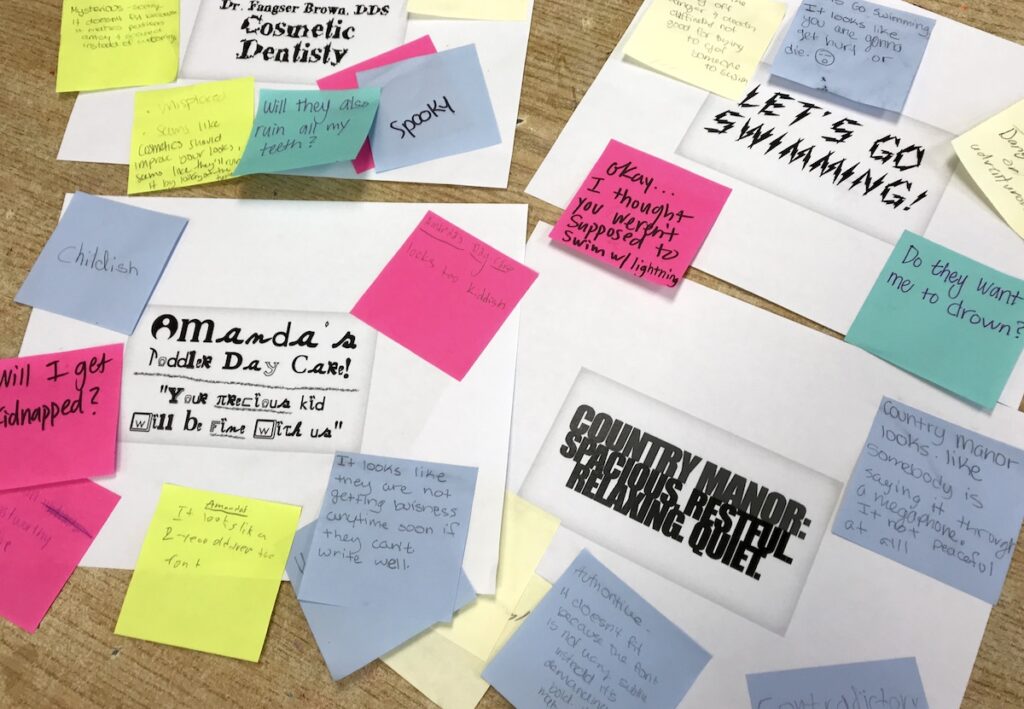
Try out this “Fonts Have Feelings” activity to show your students why font choices matter.
- Start by printing off a series of words that present a message.
Signs for companies or businesses are an excellent place to start. Make sure to choose a font that doesn’t fit with the words on the paper. You can find many excellent ideas here. - Lay out the printed text and have your students respond to the sign with their initial reactions.
Ask them how the fonts and words make them feel. The activity works best if your students do this silently and write their responses on sticky notes. - You’ll students will find it fun to read all the answers out loud at the end.
Are you looking for even more engaging instructional strategies? If so, take a peek at the AOE course, Instructional Strategies for Art Teachers. You’ll leave the course with skills to help deliver your message more effectively, refine your demonstrations, and perfect your teaching language.
2. Stress the Importance of Kerning and Tracking With a Game
Have you ever seen a word where the “c” and “l” are a little too close together, making the letter look like a “d” (cl=d)? Have you ever read a piece of text that looks like it’s squished together, leaving you with a headache? Bad spacing can make text difficult to read in more ways than one.
Teaching your students about the importance of kerning and tracking will help prevent these issues.
- Kerning
Kerning describes the space between letters or characters. Proper kerning keeps two letters or characters from becoming too close together. Without proper kerning, readers may misinterpret the letters in a piece of text. - Tracking
Tracking describes the space between words. Without proper tracking, the text can seem too squished or too spaced out.
Kerning and tracking are both important when trying to produce easy to read text.
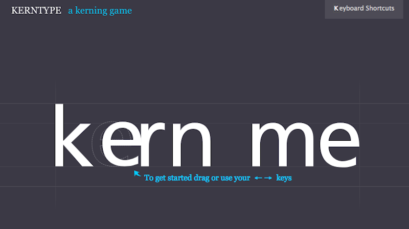
An excellent way for students to practice identifying the right amount of spacing between characters is by playing the “Kerntype Kerning Game.” The mission of the game is to achieve readable and pleasant text.
3. Have Students Design Their Own Fonts
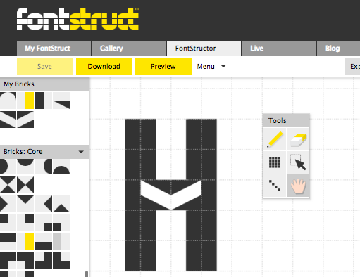
The moment your students discover an open source font database like DaFont, they become addicted to downloading new and exciting type. So why not teach them to create their own? There are many ways to create fonts. However, for beginning students, many of those programs can feel overwhelming. Instead, introduce your students to the Fontstruct website. On this website, students can easily create an extensive font alphabet that can be downloaded for use.
4. Create Foil Prints

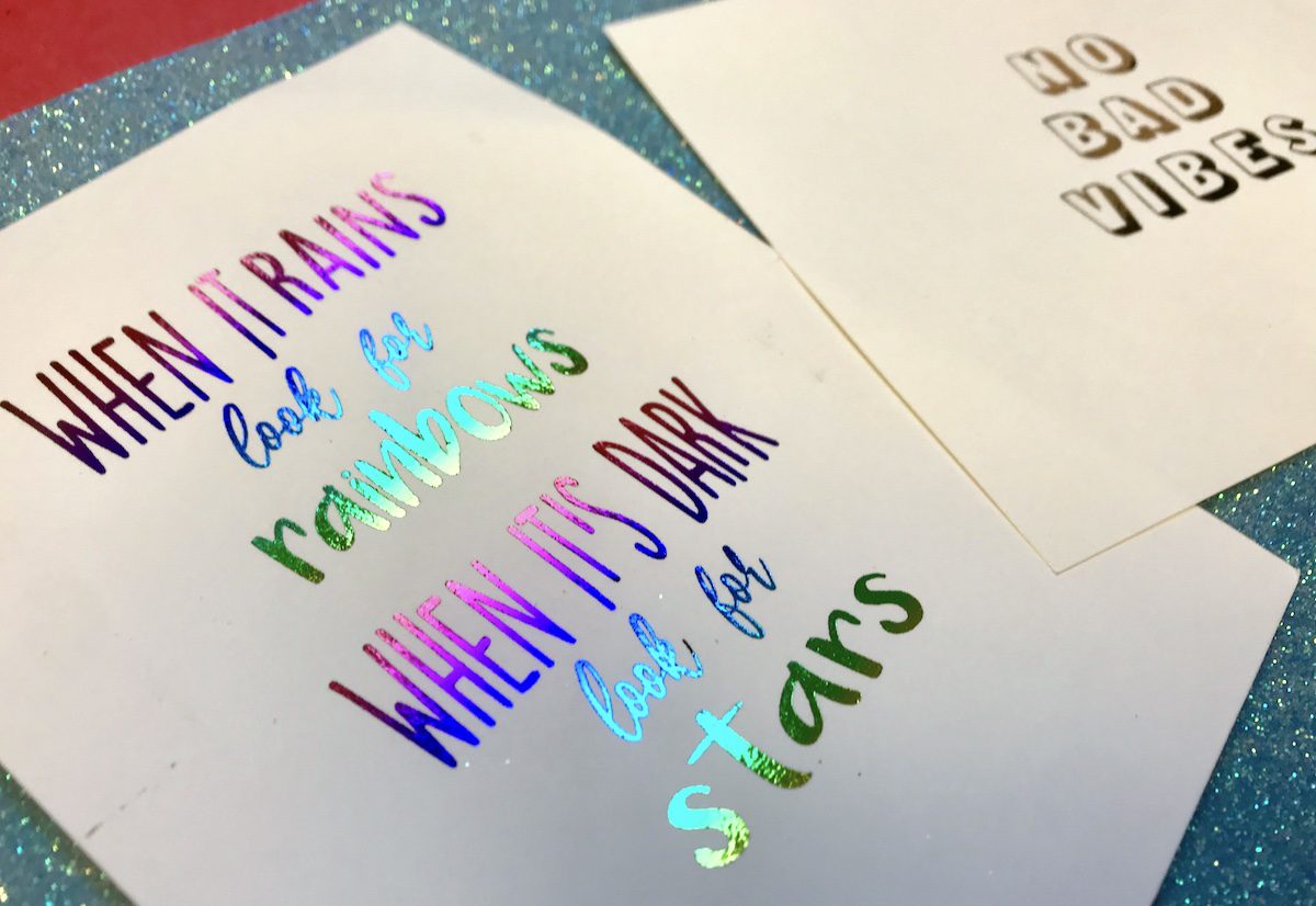
Once your students begin exploring and understanding the world of typography, they’ll want to take their designs off the computer and into their artwork. An exciting method to try is foil printing.
You can try out the technique by following these steps and checking out this video.
- Print designs on a laser printer.
- Cut foil and place the foil on top of the design.
- Run the foil and paper through a thermal laminator with no plastic.
- Peel off the foil. The foil will adhere to any of the ink from the printer.
5. Explore Text Effects with Iconicity

If your students use a program like Photoshop, the ability to transform and manipulate text is endless. From making letters look like they’re on fire to making them glow, there is something for all of your students to explore.
The concept of transforming text to look like what it spells is known as iconicity. One example would be making the word “glow” look like it was actually glowing. Iconicity is the perfect way for students to explore text effects. Start by having students select a word. The goal is to make the word look like what it says. To get your students started on over 100 different text effects to explore in Photoshop check out these tutorials.
Typography is an essential part of the design process and should be taught alongside other graphic design skills. Entering the world of fonts and typefaces with beginners might seem daunting, but trying out these five activities will help your students learn to love typography!
What is your favorite way to teach typography concepts to your students?
What do you find challenging about teaching typography?
Magazine articles and podcasts are opinions of professional education contributors and do not necessarily represent the position of the Art of Education University (AOEU) or its academic offerings. Contributors use terms in the way they are most often talked about in the scope of their educational experiences.

