Are you looking for a way to make critiques more fun and engaging for students? Why not make a game of it? In fact, maybe it’s time to turn your next critique into a battle! This idea takes an experience students may find boring or intimidating and turns it into an engaging, meaningful, enjoyable activity.
Here’s how to do it.
1. Mix up the seats!
On the day of the critique, students need to know something different and exciting is going to happen. Switching up the seating is an easy signal. Having students sit in different seats also gives them the chance to work with peers they are not used to interacting with.
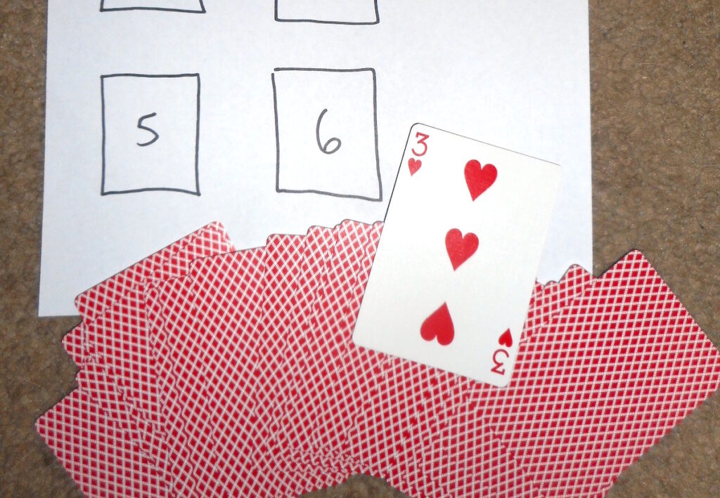
One way to keep the fun factor alive is to have an engaging way for students to get into their temporary new seats. I like to have students draw cards as they enter the room. Each card corresponds to a table in the classroom. You can put signs on the tables or project a seating chart map so students know right where to go. Students like choosing a card and tend to argue less about their new seats because it was their own “luck of the draw.”
2. Create two teams and set up the board.
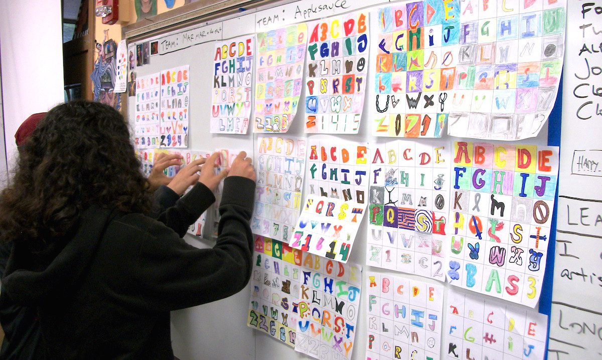
Divide the room into two teams. Set up a T-chart that is visible to the class and ask each team to shout out a random team name. Explain there is going to be a battle. Points will be kept and only one team will prevail…
Clear a large space on a board or wall and divide it into two sections. Label the T-chart and board with the team names.
3. Put student work up in team sections.
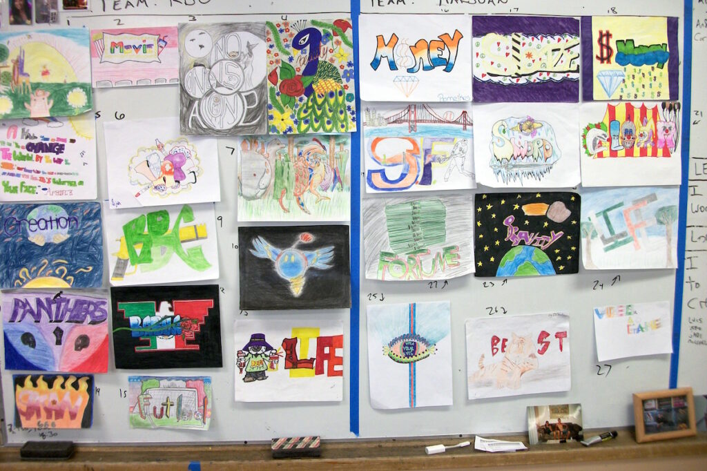
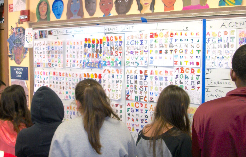
Have each team bring up their work and hang it on their side of the board. Give each piece of art a number.
4. Introduce the critique sheet.
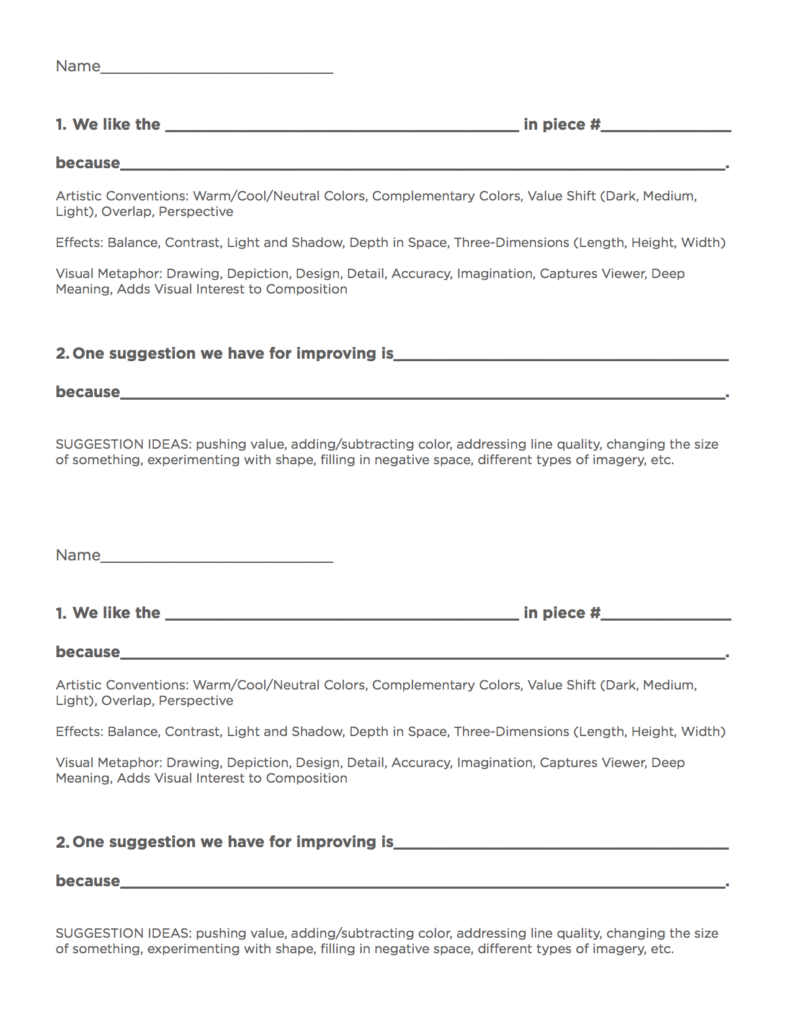
The critique sheet will guide students through the critique process with prompts. Below is the sheet I use in my classroom. It asks students to choose a piece of art and then indicate what they like about it, as well as a way they think it could be improved. I like to have students work in pairs, so two students fill out a sheet together.
You can download the sheet below if you’d like!
Each pair walks up to the board together, chooses two different pieces from the other team, and comes up with ways to fill in the blanks on the critique sheet.
One way to help the critique become more academic and meaningful is to include a specific vocabulary list to use. You could print this directly on the sheet, or display it somewhere else in your room. The vocabulary list is a word bank for both the aspects students like as well as the suggestions for improvement to help drive the critique. It can be a list of vocabulary terms that have already been studied in class, as well as other concepts yet to be applied.
Here is one example of a completed critique:
We like the complementary colors in piece number 13 because they create dynamic contrast for the viewer.
One suggestion for improvement is to focus on the line quality because it is a bit broken and could use more fluidity.
Generally, this process takes between five and ten minutes.
5. Have students present to the class.
Once you have explained the sheet, it’s time to drop the next component of the battle: students will be presenting their critiques to the entire class! When students have to do something in front of their peers, more often than not, they will step up their game. The partners and table groups are another support system for this.
Tell students when they present, their entire table will come up (roughly 4 or 5 students) together. Each student is responsible for presenting one critique, which includes what they like and why along with one suggestion for improvement and why. Points are given based on the entire table group doing those two tasks. If everyone presents one thing they like and why from an opposing team’s art piece, the team earns five points. If everyone presents a suggestion for improvement, the team earns another five points. One last way to ensure the most student work possible gets discussed is to make sure students from the same table group all critique different work. Take points away if the same piece is discussed by students who sit at the same table.
Of course, you can score in other ways, too. You could give extra points for using words off the vocab list or for pulling in a former artist or concept students have studied. Just be sure students know the scoring guidelines upfront.
In case of a tie…
If there’s a tie, or if you have some class time left, you can play a review game using the vocabulary words. In my classroom, I choose a student piece to describe using those vocab words. The first student to guess which piece I’m describing gets a point for their team. If they answer incorrectly, I move on to the next team. It’s a great way to pick a clear winner or fit a bit more learning into class time!
It’s your choice if you want to offer prizes to the winning students. Bragging rights are a pretty big deal, so you may choose to have it all be for fun. However, you may want to add a small incentive like a piece of candy or special privilege to create higher stakes.
Critiquing can be a chore and students may shy away from meaningful engagement. Luckily, as educators, we have a knack for creativity and thinking in productive ways. Turning the critique into something fun involving teamwork helps build student capacity, understanding, and peer review culture.
How do you run a critique with your students?
What questions do you have about turning a critique into a battle?
Magazine articles and podcasts are opinions of professional education contributors and do not necessarily represent the position of the Art of Education University (AOEU) or its academic offerings. Contributors use terms in the way they are most often talked about in the scope of their educational experiences.
